How to design dashboards for data insights for business decisions
You want data insights at a glance, but it’s hard to digest and process a large volume of data, and you’re creating and collecting more data all of the time. You’re suffering from DRIP: you’re data rich but information poor. To get information, you turn to dashboards, but, if you don’t design them correctly, you can become dashboard rich but information poor, what I’ll call DRIP 2.0.
In this post, I’ll talk through 3 steps, with guides, for designing dashboards to generate insights for business decisions while all forms of DRIP.
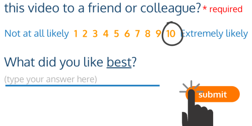
(You can watch the video version of this post, or keep reading below.)
Step 1: Define your audience and the scope of your data
You can’t be all things to all people, and neither can your dashboard. That’s the primary tenet of avoiding DRIP in dashboard design, and the first step is to get really clear about your audience and the scope of your data.
Start with some guiding questions. If you’re designing for others, create a profile of a single audience member that typifies your audience, and answer on their behalf.
- What decisions do you need to make?
- Relatedly, what questions do you need to answer to make those decisions?
Note that I’m stressing need and not want. You might want to know something, and it might be interesting to know something, but, as it relates to your goals, it won’t influence your perceptions and behavior to know this thing. The things you need to know will.
You can further refine the scope of the data by answering the following questions in the context of your first two answers:
- Do you need information about the entire business?
- Similarly, do you need information about a specific process, service, or product?
- Finally, how timely does this information need to be? Does it need to update in real time? Every week? Every month? These questions can be addressed by answering how immediately the audience needs to be able to take action based on this information.
With these questions answered, it’s time to ask the most important one for this step:
- Do you have this data?
This isn’t about whether it’s in the perfect form for what you need to do, but whether you’re collecting data on this at all, and sufficiently to do the work that you need the data to do. If not, your DRIP problem might be that you’re collecting the wrong data for your needs. Luckily, there’s no better time to start collecting data, than now.
Step 2: Align for strategy and action
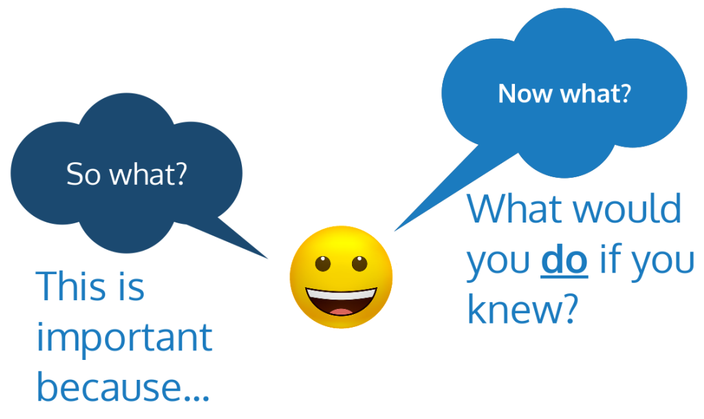
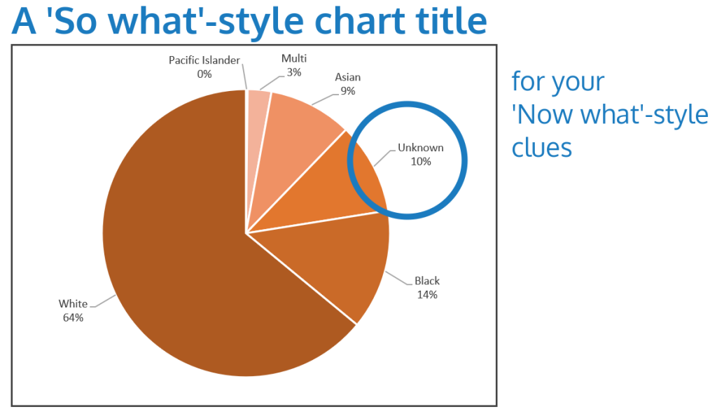
To keep your dashboard focused towards data insights for business decisions, I recommend using the phrase “So what? Now what?” to vet dashboard components.
Your answer to So What will take the form of, “This is important because…,” and you’ll fill in the blank with an answer about your audience’s strategies, goals, decisions, or questions.
As a second pass, you’ll address Now What: What would you do if you knew this information? To capitalize on what is working, what clues will your dashboard provide as to why? If something is not working, your dashboard should provide clues as to how you might revise that activity to make it more effective, or at least where to focus your investigation into why not.
If you find yourself looking at dashboards, but they’re not helping you take proactive action, you might need to revise for So What, Now What.
Step 3: Visualize and juxtapose for reflection and insight
How do you design a dashboard that enables data insight while alleviating DRIP?
Interactivity
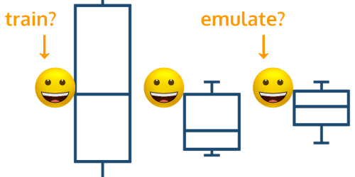
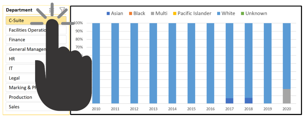
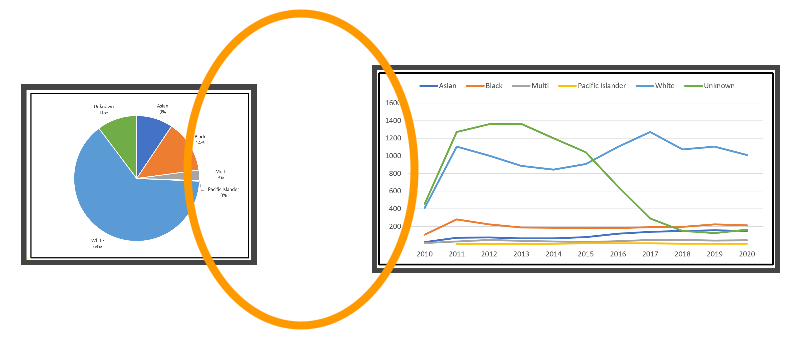
Lumping all of your data together into high-level summaries can inadvertently hide clues. Providing interaction in the form of filters or slicers can help your audience achieve the granularity needed, without requiring multiple dashboards that basically do the same thing. As an example, filters could help you refine by department or service offering.
General Layout
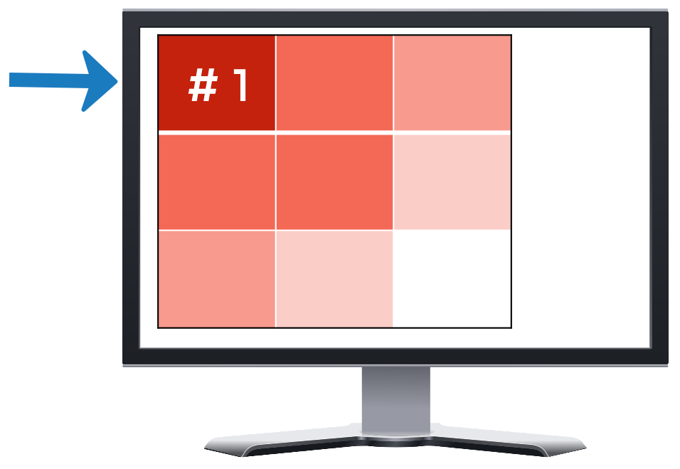
What you see first should be the most important thing related to your dashboard’s purpose. A typical layout will place that thing in the upper left hand corner of the screen. For context, you’ll juxtapose this information with related data, feathering your metrics down and diagonally.
Simplify
As a rule of thumb, your dashboard should fill a single screen at 100% zoom. Scrolling loses context, and having to remember what else you’ve seen diminishes your ability to process what you’re looking at. Still, don’t squish things just to fit them on a single screen, and use negative space between your dashboard components to keep things easily readable.
Review for Color and Labeling
Your dashboard should be aesthetically pleasing, but its purpose is data insight. Keep it informative, but not eye-catching, and be mindful of color blindless, meaning don’t use color as the only means of conveying information. Make sure each chart has a title that lets the audience know what they’re looking at in a meaningful way, relating back to the business decisions and questions. And make sure that all data labels are easily legible.
Play Around
Don’t be afraid to play around, including changing out chart types. It can be time consuming, but it’s worth it.
What will you use first?
Did you learn something from this video? Will you be revising your dashboards for action, redesigning the layout, or something else?
Let me know by leaving a comment below right now!
Looking for related content?
Sometimes, data, and the dashboards that invoke it, are inappropriately applied to business strategy due to a misunderstanding of the nature of data. A classic example is using social post views to assess the “success” of a social campaign. To learn more about where data comes from, check out our post on Where data comes from for data-driven decision making.
If you’d like more information on how to choose the “right” visualization for the job, check out our post on Choosing the right visualization: A DEI example.
—
The concept of DRIP is borrowed from the book In Search of Excellence by Thomas J. Peters and Robert H. Waterman, Jr.
Want help with your dashboards?
If you would like to discuss how to collect or curate data for your dashboard, how to design interactive dashboards for yourself in Microsoft Excel, or would like hands-on help with your dashboard creation, reach out and let’s discuss.