In order to effectively close the gap between where you are now and where you want to be, you need to know that the gap exists and how big or small it is. One way to do this is with a reporting tool called a scorecard. Much like the checked and unchecked items on a to-do list, a scorecard gives you a snapshot of the gap between where are you now and a target, where the target can be a growth goal you’ve set for yourself, or a projection of where you think you’ll be by a certain date, all things considered.
Tag: metrics
Choosing the “right” visualization: A diversity, equity, and inclusion example
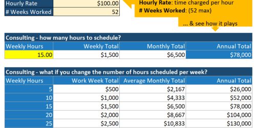
When we talk about Diversity, Equity and Inclusion (DEI) efforts, we frequently turn to the data to see how we’re doing relative to our own internal goals, and, as possible, how our efforts and relative success rates compare to those in our local communities and others in our industries. That is, we typically talk and think in terms of benchmarks and progress towards a target percentage. But we don’t just need to wrangle and analyze the data. We also need to communicate the findings of the analysis so that we can figure out what to do next, and this is where choosing the right visualization comes in. In this post, I discuss how different visualization choices enable different understandings of the data, and different conversations and decisions around the data.
Vision to Action: Turning ideas into actionable and measurable steps
It can be hard to figure out how to turn big picture ideas and goals into actionable and trackable steps. For many things, the “figuring out” lies in a mixture of clarity, and then reframing and rephrasing. Here we take a monetary target and some other information from a business model, and turn it into something that’s doable, measurable, and actionable. If you’re stuck at this part of the process, this post might help.