Choosing the right visualization: A diversity, equity, and inclusion example
It’s frequently the case that we don’t just need to wrangle and analyze the data. We also need to communicate the findings of the analysis so that we can figure out what to do next. This is where choosing the right visualization comes in. In this post, I discuss how different visualization choices – in particular, a pie chart, a line chart, and a 100% stacked column chart – enable different understandings of the data, and different conversations and decisions around the data.
(You can watch the video version of this post, or keep reading below.)
A Typical Diversity, Equity, and Inclusion Scenario
When we talk about Diversity, Equity and Inclusion (DEI) efforts, we frequently turn to the data to see how we’re doing relative to our own internal goals, and, as possible, how our efforts and relative success rates compare to those in our local communities and others in our industries. That is, we typically talk and think in terms of benchmarks and progress towards a target percentage.
For the purposes of this post, let’s use a scenario in which fictional employees have self-reported demographic data as part of their job application process. Your resulting dataset includes department information as well as standardized demographic classifications for ethnicity, race, and gender.
You’re interested in knowing whether your employee population is trending towards establishing or maintaining a certain level of racial diversity, primarily through percentage targets. In other words, you need both percentages and changes in those percentages over time.
The Pie Chart for Percentages
A pie chart is a natural choice for visualizing percentages. This pie chart shows the racial makeup of the dataset’s employees in 2020.
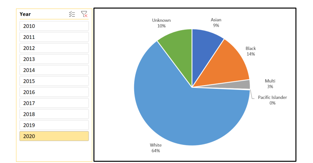
While the number of racial categories represented here is small, representing too many categories with a pie chart has the obvious problem of making the data difficult to read and digest, which makes it harder to understand and use for decision making. If diversity within the company were to grow, and the number of racial categories were to increase, the pie chart would lose its usefulness as a means of displaying percentage breakdowns.
The bigger problem is that a pie chart is a single snapshot, much like a photograph captures a single moment. There is no history here, meaning that it has no context to show whether this is an improvement over where you were a year ago or whether you’re on the right track for your targets.
If all you needed was a simple yes or no to see if you’ve met a certain target percentage, this might be sufficient. Since, in this scenario, you’re interested in assessing how you’re trending, you need a different visualization.
The Line Chart for Trends
A line chart is the standard go-to for trends over time. In this chart, each line represents a racial category, with each data point showing the count of employees at that time.
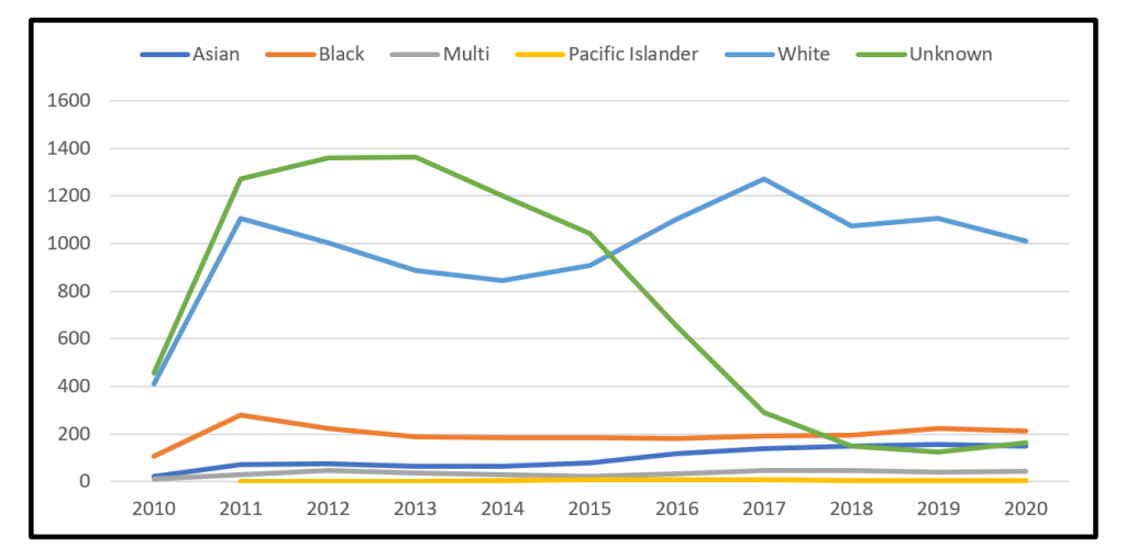
This chart gives you the history you’re looking for, but isn’t very impactful. It requires a lot of mental work to figure out how these trends translate in terms of your percentage goals. You could plot percentages instead of the count of employees, but the intersecting lines can still make it difficult to understand the implications of various changes over time.
Are you on track? Maintaining? Trending away? Figuring this out is mental work you should be reserving for figuring out what to do about where you’re at and how you’re trending, not figuring out where you’re at in the first place.
The 100% Stacked Column Chart for Percentages and Trends
My favored option for this scenario is the 100% stacked column chart. This format provides trends over time as well as percentages at each of the time slices. Each column represents 100% of the data at that time, sort of like a flattened pie chart.
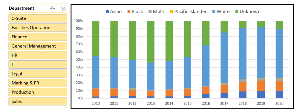
At a glance, you can quickly see how each racial classification is trending over time, which means that you get the information you need for the question you’re asking, and you’re reserving your mental energy for reflecting on what the data is telling you and what you want to do next.
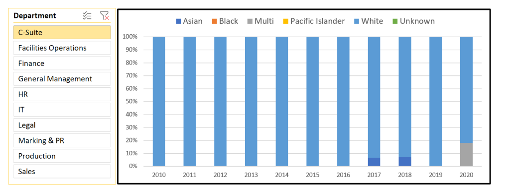
When you combine this visualization with a slicer or filter, it’s also easy to explore the trends in terms of the departments and other factors represented in your dataset, and that provides a richer context, and a better understanding of where you might need to focus our efforts to achieve your goal.
I want to emphasize that this visualization claims a 100% representation of the population in question. So I’ve included a category for UNKNOWN, which ensures that each employee is still counted, even if that employee opted out of answering demographic-related questions. The claim of 100% would be misleading otherwise.
Visualization Lessons from This Scenario
When working with your own demographic data, you could obviously extend this scenario to any situation with participants, such as students in a college-level program, committee memberships, or members of a networking group.
Whatever the case, it’s important to verify that your visualizations are:
- appropriate to the questions being asked,
- enable the types of conversations and decisions you want, and
- require a minimal amount of mental energy being used to understand what the visualization is trying to tell you.