One of the primary tools of the client intake process is the intake form.
In this post, I talk about how to set up tools like your client intake forms to help make your client intake processes as simple and efficient as they need to be.
One of the primary tools of the client intake process is the intake form.
In this post, I talk about how to set up tools like your client intake forms to help make your client intake processes as simple and efficient as they need to be.
No one is just one thing.
And that matters when you’re writing things like those client personas that we’re all supposed to have.
But how do you capture that nuance in a survey?
One way is to use the multi-select checkbox question, e.g., check all that apply. But how do you write a checkbox question that gives you information instead of just a grab bag of data? By
There are so many good use cases for open-ended questions, and including them as part of your surveys can really increase the insight you can glean from your respondents. But:
There are three files involved in the mail merge process: the Data Source, the Mail Merge Template, and the Review Document (which is sometimes called a merge document). In this post, I’m going to explain each one, covering where they come from, what role they play in the process and how they’re related to each other, and, finally, when it’s time to update them.
Do you ever overthink or overanalyze to the point where you stop making decisions and taking action? Where you’re afraid that the choice you’re about to make isn’t the BEST choice, so you wait it out a little more, and maybe research a little more, and maybe gather together more data … just so you can be SURE? That’s called analysis paralysis.
Debunking the myths of being data driven and being successful can set you free.
If you’ve ever targeted an email marketing campaign to a specific demographic, assigned a category to your blog post, or chosen a hashtag for your social post, you’ve used data classification. Classification is basically the process of chunking up or organizing your data, into different groups or under different labels, so that you can quickly isolate and bring together all of the things that belong to that group, so that you can do something with that group:
In this post, I’ll discuss the problems that arise from unclassified or improperly classified data, and give some pointers on how to create and apply your own classifications.
In order to effectively close the gap between where you are now and where you want to be, you need to know that the gap exists and how big or small it is. One way to do this is with a reporting tool called a scorecard. Much like the checked and unchecked items on a to-do list, a scorecard gives you a snapshot of the gap between where are you now and a target, where the target can be a growth goal you’ve set for yourself, or a projection of where you think you’ll be by a certain date, all things considered.
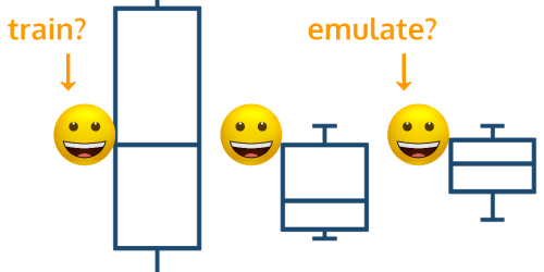
We all know that there are only so many minutes in a day, and that goals like being more productive and effective hinge on things like better time management, that is, working smarter not harder. This is particularly true if you think you’ve got a pretty standard process in place. In this post, I’m going to demonstrate a visualization tool called a box and whisker plot. This tool will help you determine how long you can typically expect your standard process to take, and how to spot when there’s enough variability to say that it’s time to reexamine what you’re doing, so you can:
If you can find the middle thing in a list, you can do this time analysis.
TL;DR? Big data knows what questions people have, and you can capitalize on that to generate an endless list of answer-focused content ideas that draw from and showcase your experience, knowledge, and expertise. Scroll down to the section titled ‘Bringing it together’ for a quick list of the steps. Scroll back up for the nuance.
There’s nothing new under the sun, so what could you possibly have to offer the world that hasn’t been addressed before?
I’m always a big advocate of asking people for help when I get stuck, and, as it turns out, people are telling you what they want you to talk to them about all of the time. If you’re systematic about how you listen, you’ll build up quite a data store to flip through the next time you’re missing your muse and staring down a blank page and a deadline.
You want data insights at a glance, but it’s hard to digest and process a large volume of data, and you’re creating and collecting more data all of the time. You’re suffering from DRIP: you’re data rich but information poor. To get information, you turn to dashboards, but, if you don’t design them correctly, you can become dashboard rich but information poor, what I’ll call DRIP 2.0.
In this post, I’ll talk through 3 steps, with guides, for designing dashboards to generate insights for business decisions while all forms of DRIP.