Analyzing time spent: Time management with box and whisker plots
We all know that there are only so many minutes in a day, and that goals like being more productive and effective hinge on things like better time management, that is, working smarter not harder. This is particularly true if you think you’ve got a pretty standard process in place. In this post, I’m going to demonstrate a visualization tool called a box and whisker plot. This tool will help you determine how long you can typically expect your standard process to take, and how to spot when there’s enough variability to say that it’s time to reexamine what you’re doing, so you can:
- streamline a process for yourself, or
- identify when it’s time to schedule a training or other intervention for your staff.
If you can find the middle thing in a list, you can do this time analysis.
Overall, this approach can help you get a better handle on your pipelines and workflows, because you’ll know approximately how much time you have to allocate and expect for this process in the future.
This post is broken into three (3) parts:
- the data you need to be tracking,
- the box and whisker tool we’re going to be using,
- and some sample applications.
(You can watch the video version of this post, or keep reading below.)
How to collect data to track your time
The data that you need to collect for this is pretty simple.
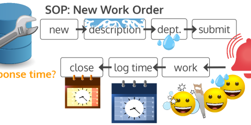
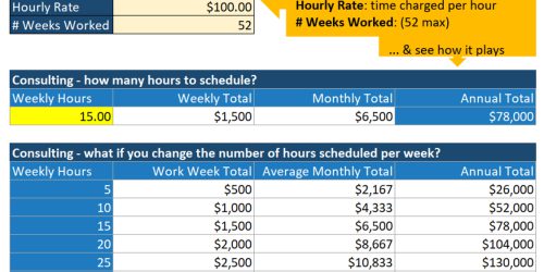
Basically, you’re going to create a summary time log of how long it takes you to perform a certain task, from when you first start to when you completely finish. The time you’re recording could capture how many hours and minutes it takes you, or it could capture how many sessions or touch points it takes. Which one you pick really depends on the type of process. Consultants will probably be more interested in hours and minutes. Physical therapists and salespeople might be more interested in number of sessions or touch points.
Either way, you’ll be working with a simple table of data that records a number for each instance of that process, where each instance, or row, could represent a different client, and where each number reflects the total hours or the total number of sessions with that client. If multiple staff members are being compared, each person will have their own table of data.
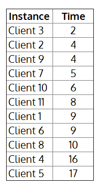
If you have an ongoing process in the works, you can ignore it for the sake of this example, and just focus on your historical data. When you’re ready to use the data, you’ll sort each of your tables independently, in order from smallest total to biggest.
How to visualize time range and variability with a box and whisker plot
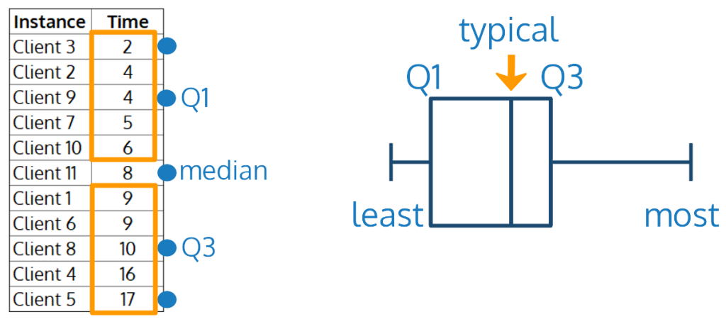
Starting from a sorted data table, the box and whisker plot, so named because it looks like a box with two whiskers coming out of it, gives you a quick and dirty summary of:
- the least amount of time this process took you, on the left end of the left whisker,
- the most amount of time this process took you, on the right end of the right whisker,
- and the typical amount of time this process takes you, with the box around that number indicating what I’ll call your wiggle room variability.
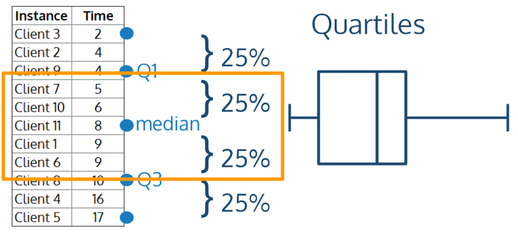
The typical amount is marked by the median, and it won’t necessarily be in the center of the line. The median is the middle number of the list. If you have an odd number of rows in your table, it’s exactly the middle number. If you have an even number of rows, it’s the average of the two middle numbers.
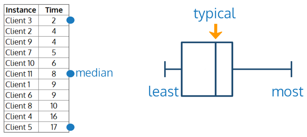
To draw the box around that typical value, we’ll find medians again. The left side of the box, called Q1, is the median of the rows before the median of your entire data table. The right side of the box, called Q3, is the median of the rows after the median of your entire data table.
Now, what we’ve really done is break the data in quartiles, meaning that each section represents about 25% of your table data. So, 50% of the time, your process takes less than the median amount of time, and 50% of the time, your process takes more than the median amount of time. And the box itself represents about 50% of the data again, because it’s made up of 2 quartiles. That means that about 50% of the time, your process time falls somewhere between Q1 and Q3.
As a note, a box and whisker plot could also help you identify outliers in your data, but that’s not relevant to this time management application, so I’ve left that out.
Sample: Analyzing your own time spent data
Let’s say that you’re a solopreneur and you think you’ve got a pretty standard process. Unfortunately, when you look at Q1 and Q3, you see that sometimes this is taking you 4 hours and sometimes it’s taking you 10. That’s a lot of variation in your range. If you can’t really account for the difference, it might be time to work on streamlining by either revising your existing process steps or, if you don’t already have one, writing a standard operating procedure, or SOP, to help you get on top of those process steps in a more consistent and reliable way. You’ll see that your change is working if Q1 and Q3 get closer to your median typical time.
You could also break down your data by year to see if it’s taking you longer over time, and whether you might be getting sloppier in your application of your process. But it could be that you’re taking on different types of clients, or your process has been refined so you can provide a better service, and there’s nothing wrong here. It’s just different from what it was.

Note that in the above image, the least time is at the bottom (instead of on the left) and the most is at the top (instead of on the right). This is a simple rotation of the way the box and whisker have been drawn so far, and is the typical way that this visualization would be displayed.
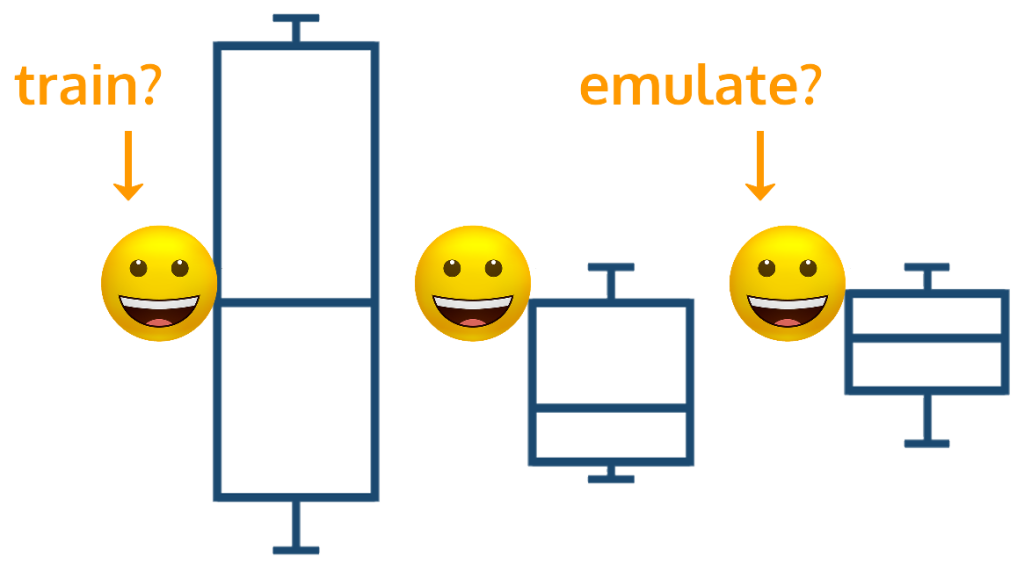
Sample: Comparing employee performance
If you oversee a staff, comparing their box and whisker plots can uncover interesting variations in performance between staff members who are supposedly performing the same task the same way. This could flag a staff member who might benefit from training or another intervention, or it could highlight that someone is performing exceptionally well and you want to see if you can emulate what’s working for that person among the entire staff.
What will you use first?
What processes will you apply this to?
Will you start tracking your time differently?
If you’ve been logging time already, will you use a box and whisker plot to see if it’s time to streamline?
Let me know by leaving a comment below right now. If you have your own favorite time management or analysis tip, drop that in the comments, too!
And don’t forget to share this with someone who needs it!
Want help with process analysis?
If you would like to discuss how to wrangle your data or analyze your processes, please reach out to me.